Project Details: Designing a digital healthcare management portal for health-conscious seniors
Role: Lead designer & head researcher; project manager & coordinator
Timeline: 7 Months
Welcome to Silver First
Tasked with the delivery of a breakthrough app to compete in the already oversaturated healthcare marketplace, we came at it sideways, and found a new/old angle well worth the pursuit, senior (adults 65+) healthcare. As the brainchild of our micro-targeted user research and good, old fashioned, design thinking, Silver First developed over the next 7 months both as a brand name, and a subsequent app release.
The BIG Idea
A digital healthcare manager designed to meet the everyday medical needs of seniors
User Interviews
User interviews the first opportunity we'll have to engage with our desired demographic. Our goals are the following:
1. Learn as much as possible about target audience from firsthand respondents
2. Pinpoint actionable insights with regard to app structure features, functions, and general layout
3. Find common concerns among potential users to help narrow app focus
User Research Analysis
Key Finding: Seniors absolutely feel daunted by the modern, digital tech-reliant healthcare landscape.
Insights Gleaned:
1. Ongoing struggle to search for and/or find quality doctors online
2. Trouble with automated messaging systems & in-app appointment bookings
3. Frustration with "Too gadget-y" (their words) means for even the most mundane tasks
Conclusion: When it comes to managing their everyday health, seniors crave simplicity, assurance, and direction.
*Map color-coded by interviewee
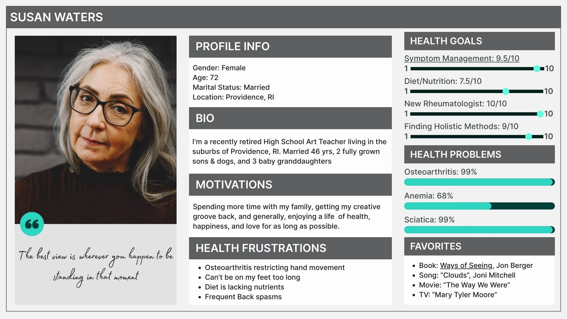
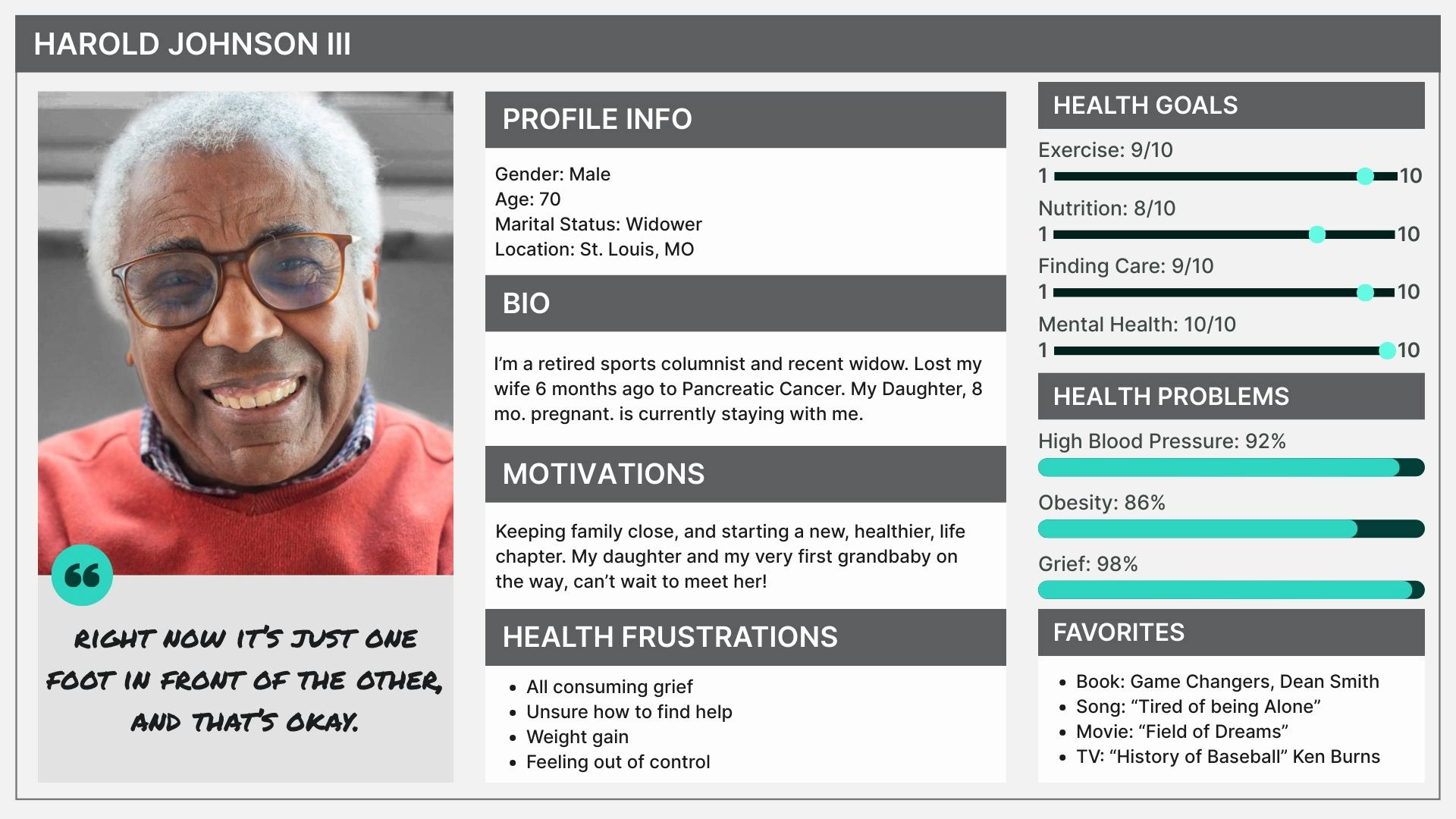
Meet Susan & Harold
Our 2 newly minted user personas below, now represent our target users. Their needs mimic the needs of our prospective customers, and therefore, understanding them, is essential to our app feature development process.
Task Analysis: Susan
Objective: Susan, a first time user of Silver First, must create an account for her Login. Follow Susan as she navigates her way through all of her first login options, and successfully creates her account, below.

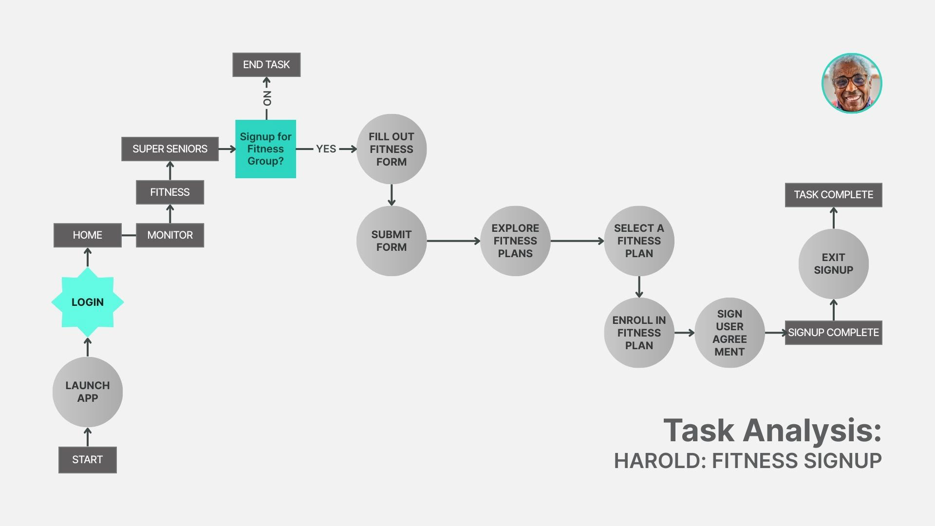
Task Analysis: Harold
Objective: Harold, a new Silver First member, is looking for a low impact exercise program to ease back into working out. Follow Harold as he navigates his way through "Super Seniors" fitness signup, and successfully enrolls in a plan.
Information Architecture
Thanks to our respective user personas, Susan & Harold, we felt confident in our feature focus, and ready to begin laying out the app's navigational framework. We then organized our data into the hierarchical feature categories seen below, and our tentative sitemap emerged.
Wireframes
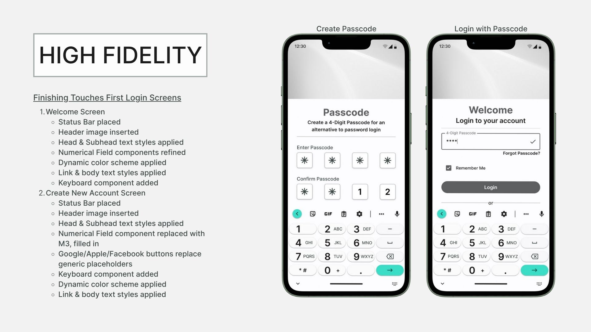
The screen evolution between low, middle, and high fidelity wireframes, is pretty massive when you compare them side by side. Check out the transformation of each app user flow starting with first login, directly below. Watch the brief videos immediately following, to see the rest.
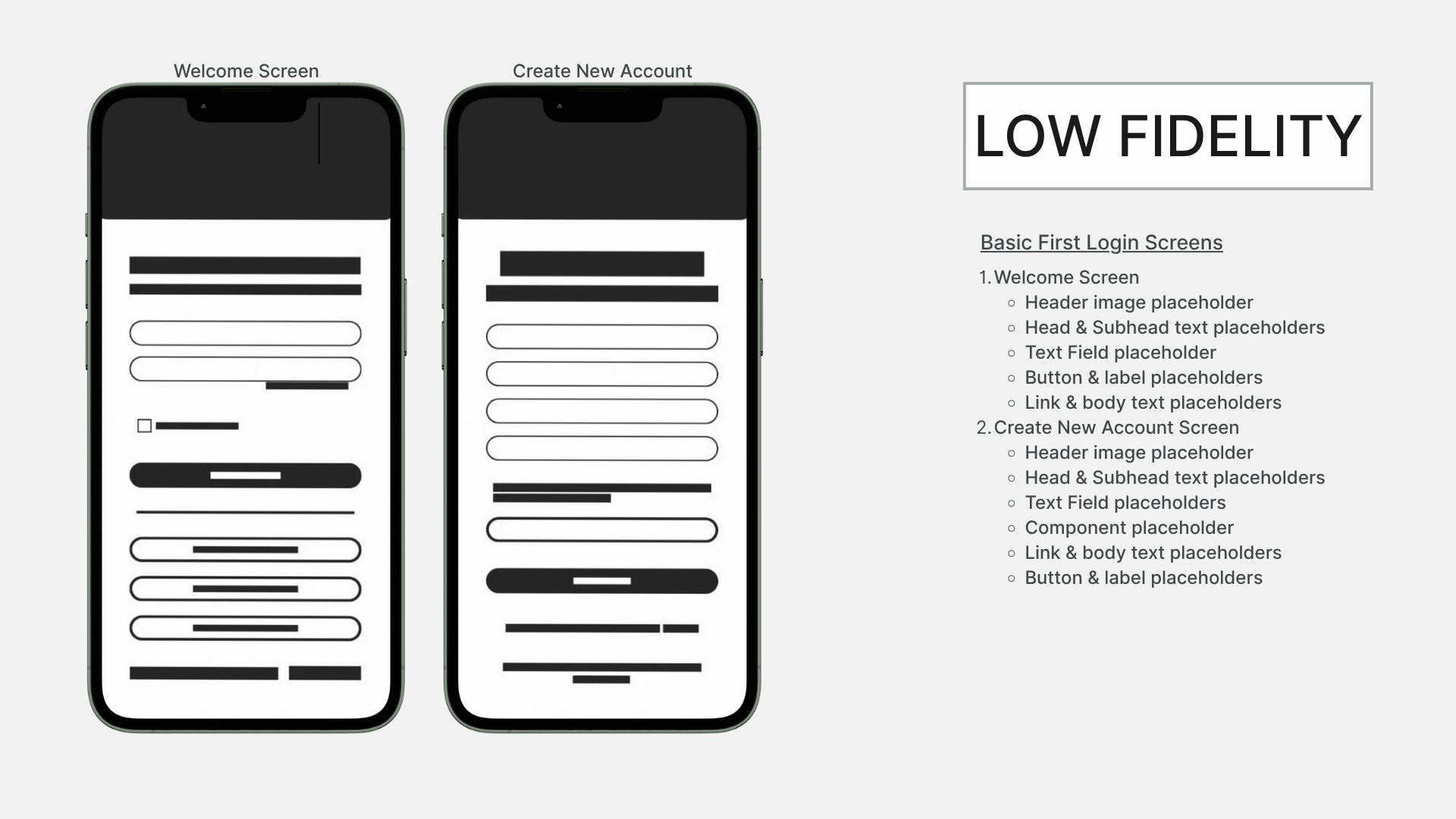
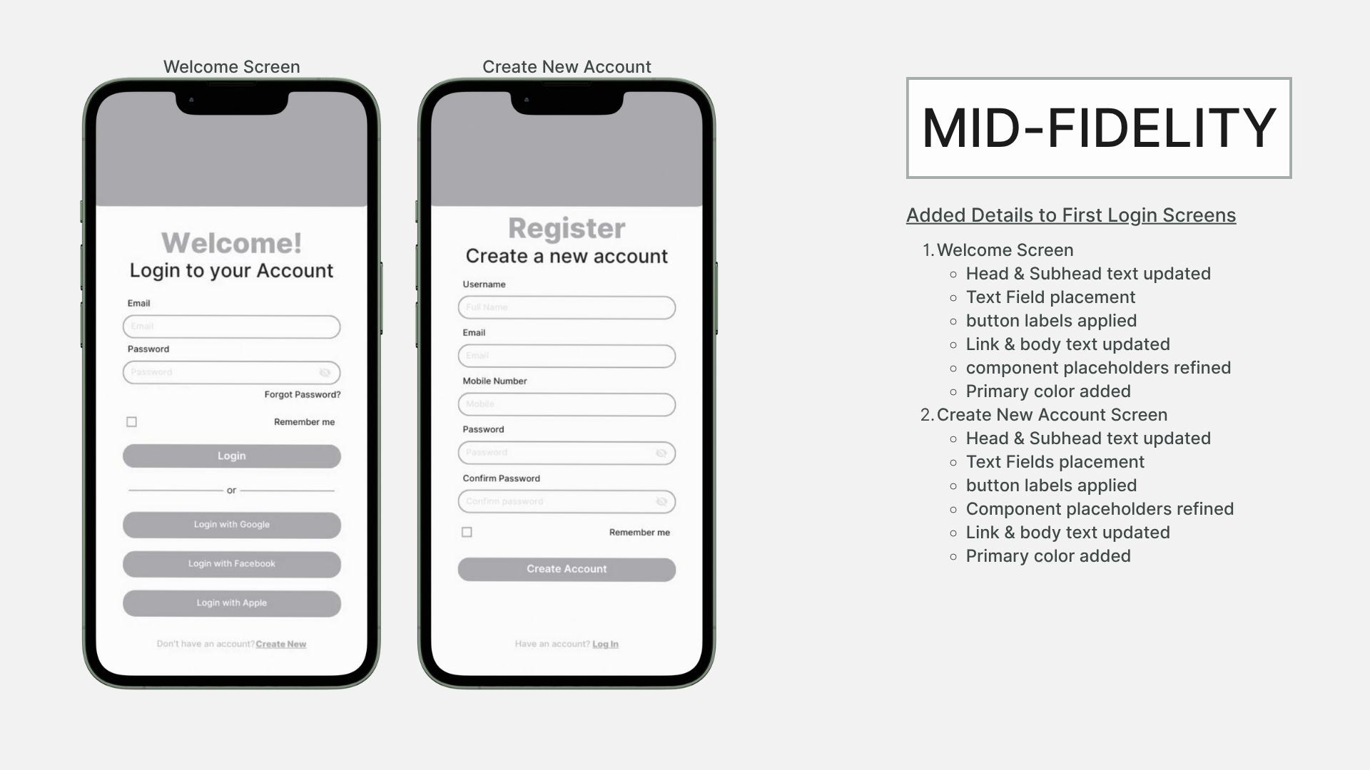

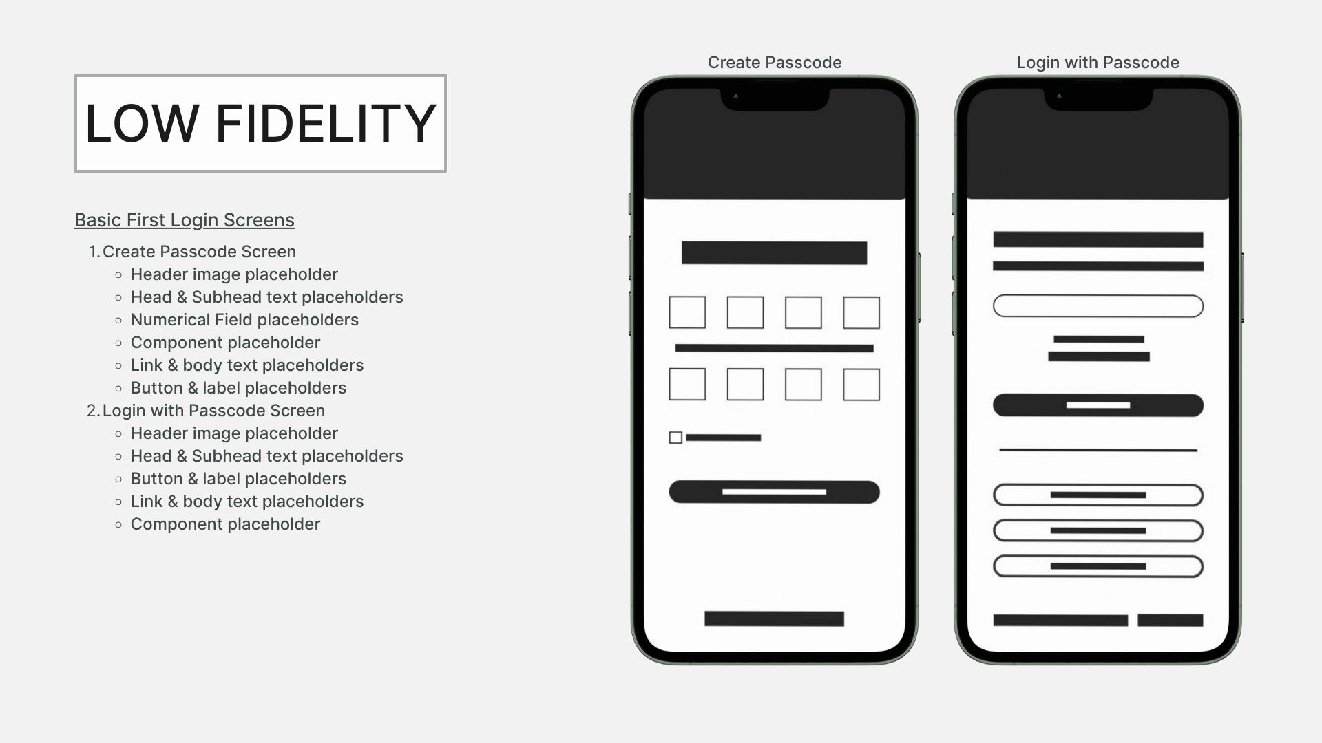
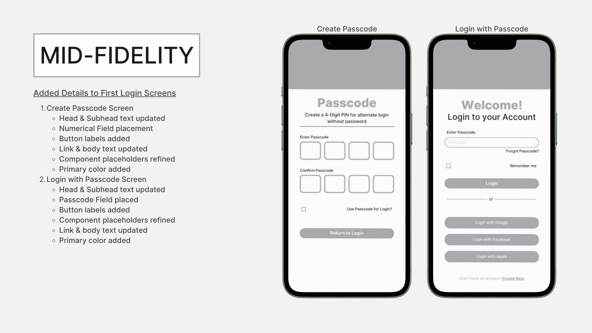
Low-Fidelity Wireframes
Mid-Fidelity Wireframes
High-Fidelity Wireframes
Usability Testing
In order to see how Silver First will fare in the hands of its target demo, we'll be recruiting a handful of participants from of our target demo to test our prototype, first hand.
Main Objective:
Main Goal:
Assessing the learnability of Silver First's 3 core app features in the hands of our real life, target audience (seniors).
Identifying usability flaws within Silver First's 3 core app that prevent successful task completion by our target audience (seniors) during their usability testing session.
To see the full Usability Test Plan, click here
Usability Test Results
Following 2 moderated, in-person usability test sessions, there were a few minor errors and one that noticeably obstructed potential users path forward in this particular instance.
Session 1: Six participants total, ages widely varying from 33-81
Session 2: Three participants total, ages befitting the target demo (65+)
Top Error:
Fitness Center radio buttons not working properly, likely configured incorrectly.
Top Error Fix:
As it has rightfully turned out to be a component issue and not a design flaw, it'll be reviewed, reconfigured, and retested in Figma prototype until the problem has been resolved.
To see the full Usability Test Report, click here
Material Design
Our high fidelity, clickable prototype is perfect for usability testing, but even with all of the subsequent changes made following, we're nowhere near marketplace ready. Now, we shift gears from design process to design application, using the latest M3 guidelines to level up.
Design Style Guide
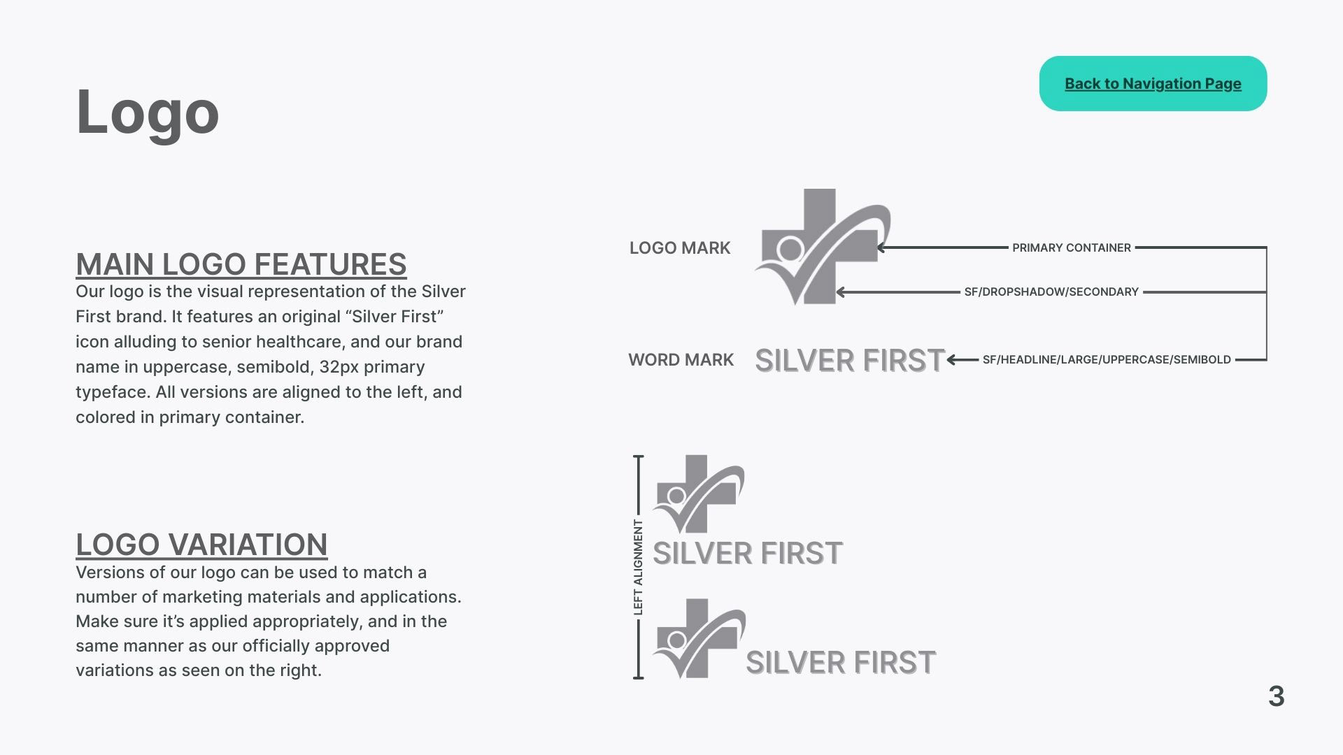
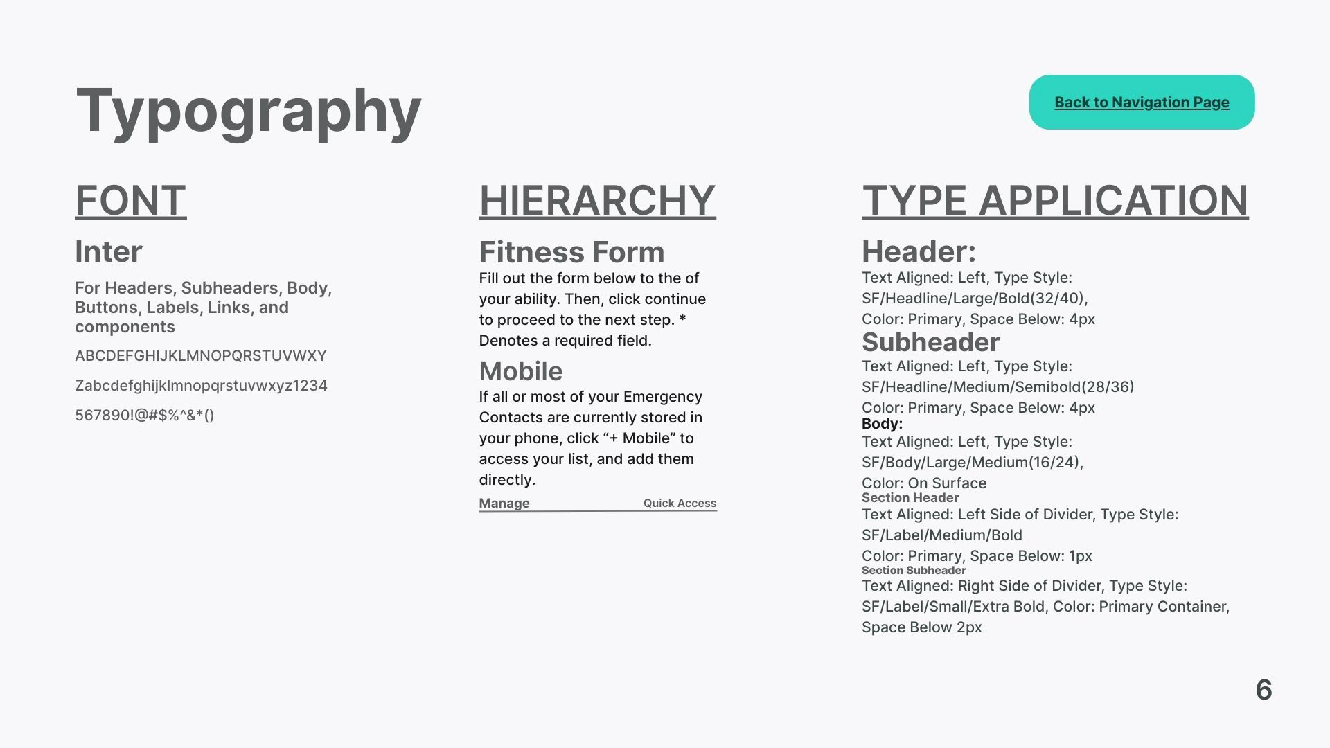
As you can see in the select pages of our style guide below, the Silver First design documentation is incredibly thorough. It's not just a record of brand origin, but also, the very key, to its brand future. The logo, color scheme, typography, and icons for instance, contribute to the distinction of Silver First as a brand, and its cohesiveness as an app. For those tasked with its continued maintenance over time, this guide, is their ticket.
To view the full Silver First design style guide, click here


Silver First Figma Prototype
Try out the latest version of our working prototype, and test some of the features for yourself using our Figma embed below.
AI Integration
Nurse Ann opens the door to the future of healthcare tech innovation without complicating things unnecessarily for our target audience. As an AI assistance mechanism for seniors, we maintain she should always be more helpful than smart.
Final UI.
This is it! The end of a very fruitful team effort, and one that we can officially announce, is coming to an app store near you, very shortly. Below are the current iterations of our initial user flows, check it out.
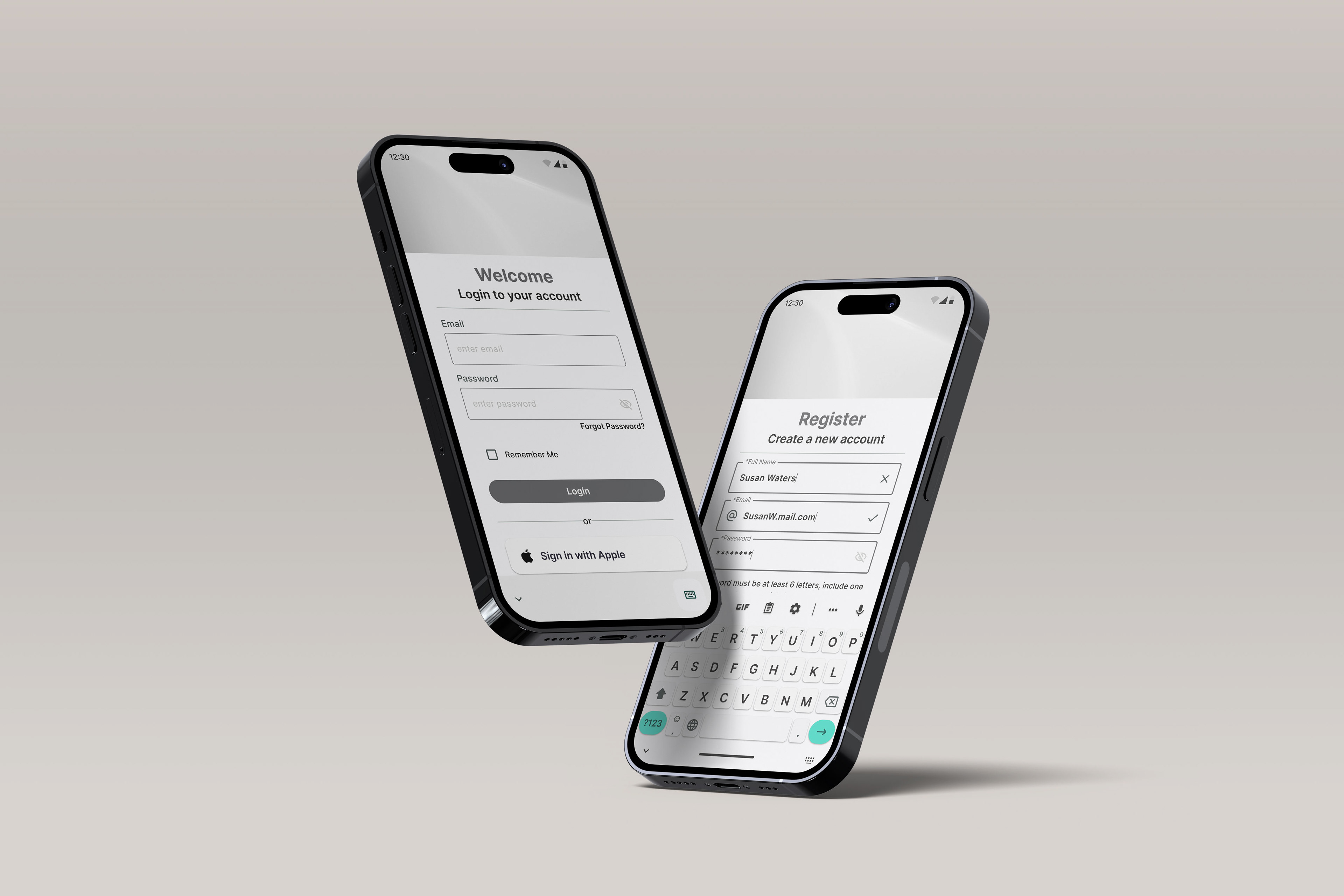
Register New Account
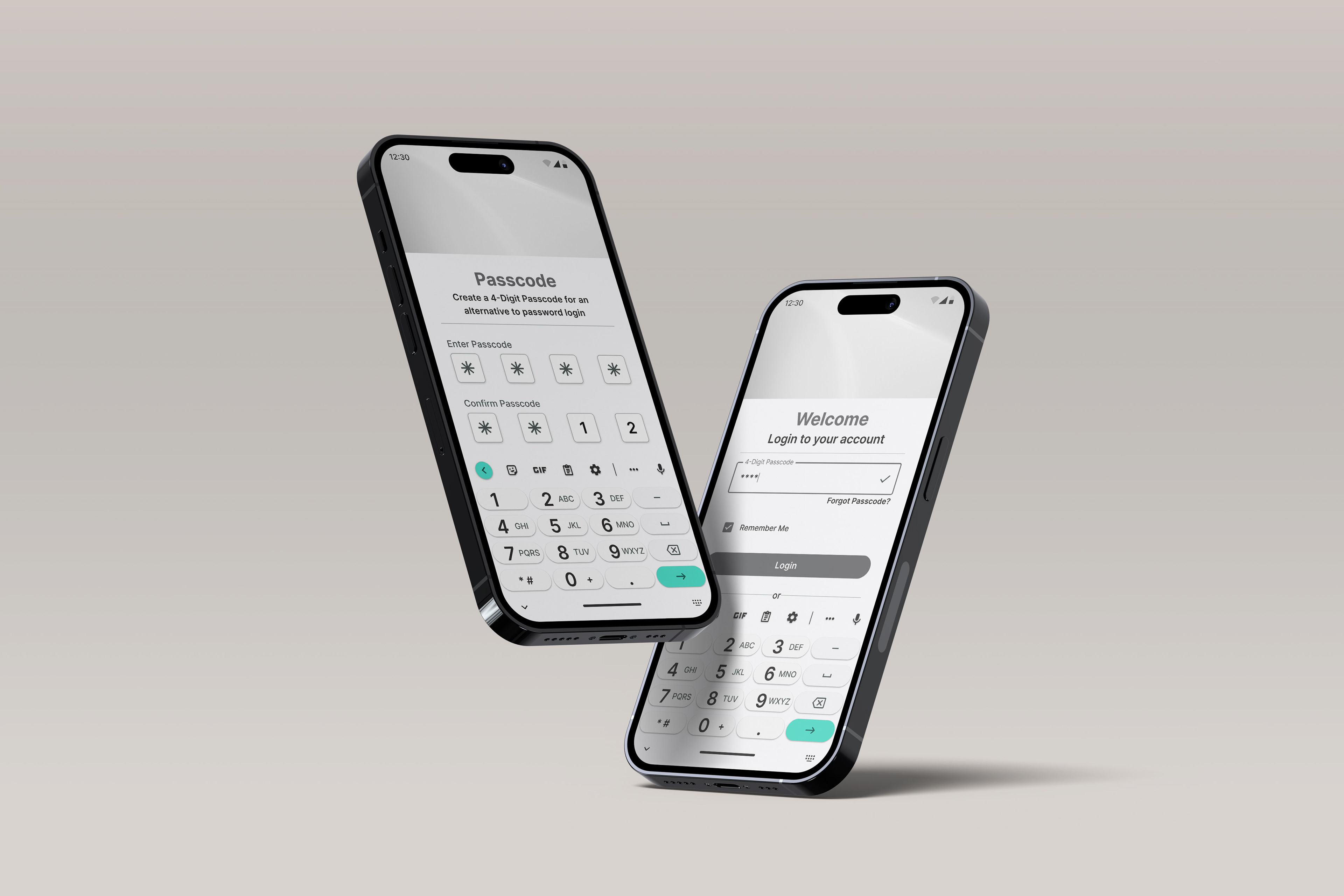
4-Digit PIN Login

Home, Community & Profile Pages
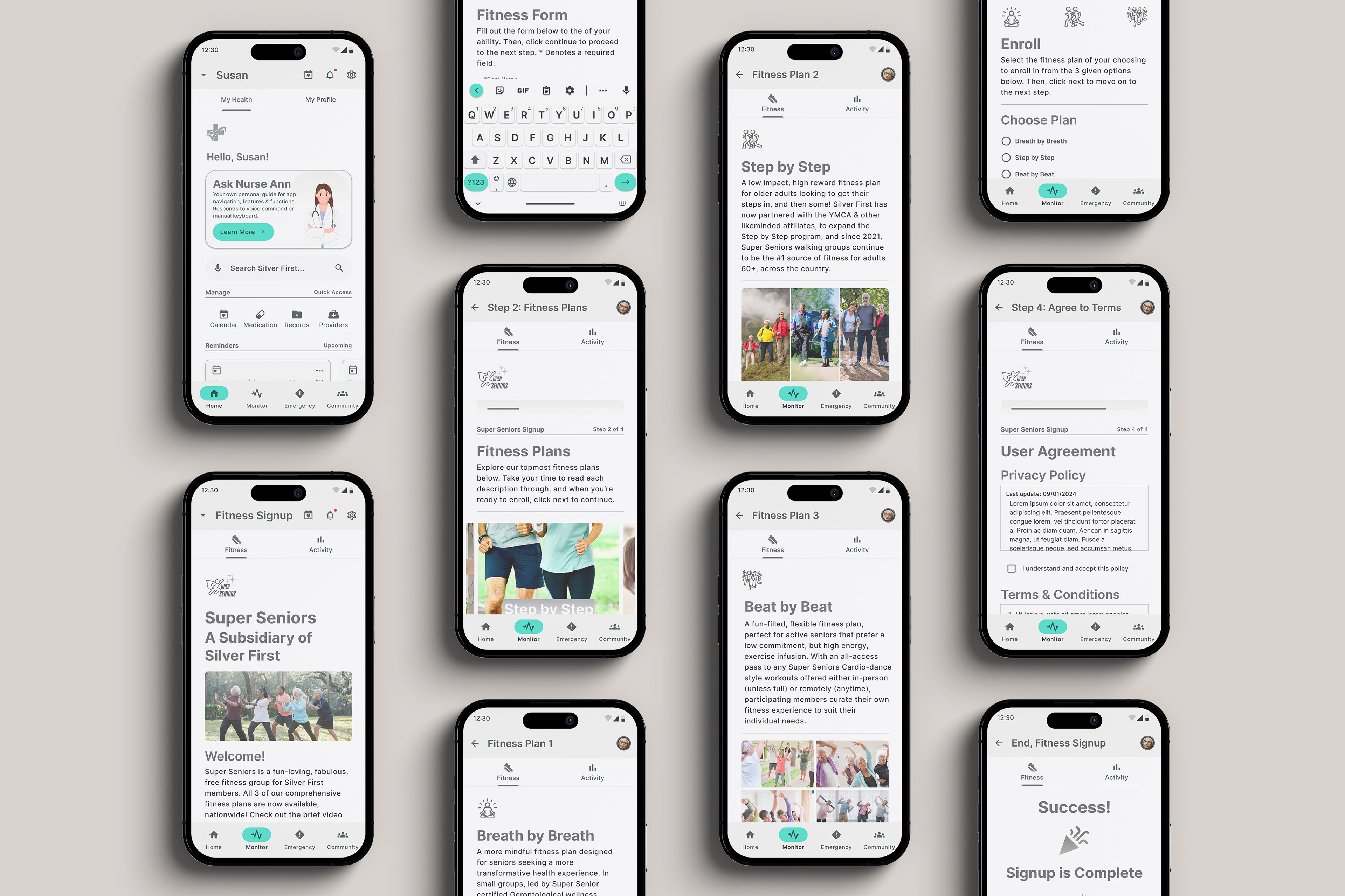
Super Seniors Fitness Signup

Medicine Cabinet Setup

Emergency Contact Directory Setup
What's Next?
Consumer Growth Projections:
If we maintain our thoughtful, tech friendly approach to digital self-healthcare management, our senior base will see exponential growth in years 1-5.
Consumer Market Projections:
Years 1-5: We continue catering exclusively to our Silent Generation/Boomer base to strengthen our brand identity among existing users.
Years 6+: We begin catering to the elder Gen X-ers, then Millennials, Gen-Z, etc., as they become the senior majority, and the brand can pin-point their needs.


